Contact Info
Contact Info Section
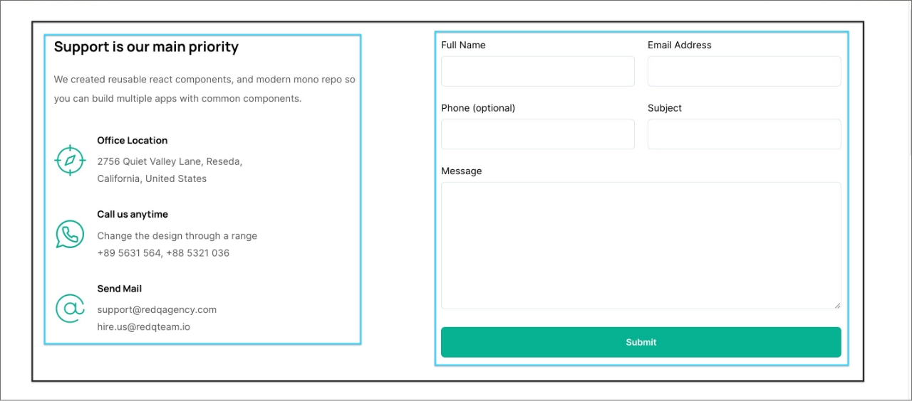
This section is consist of 3 main blocks with built in gutenberg columns block -
- Block Wrapper
- Contact Info
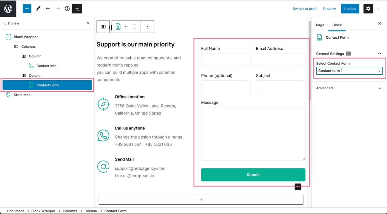
- Contact Form
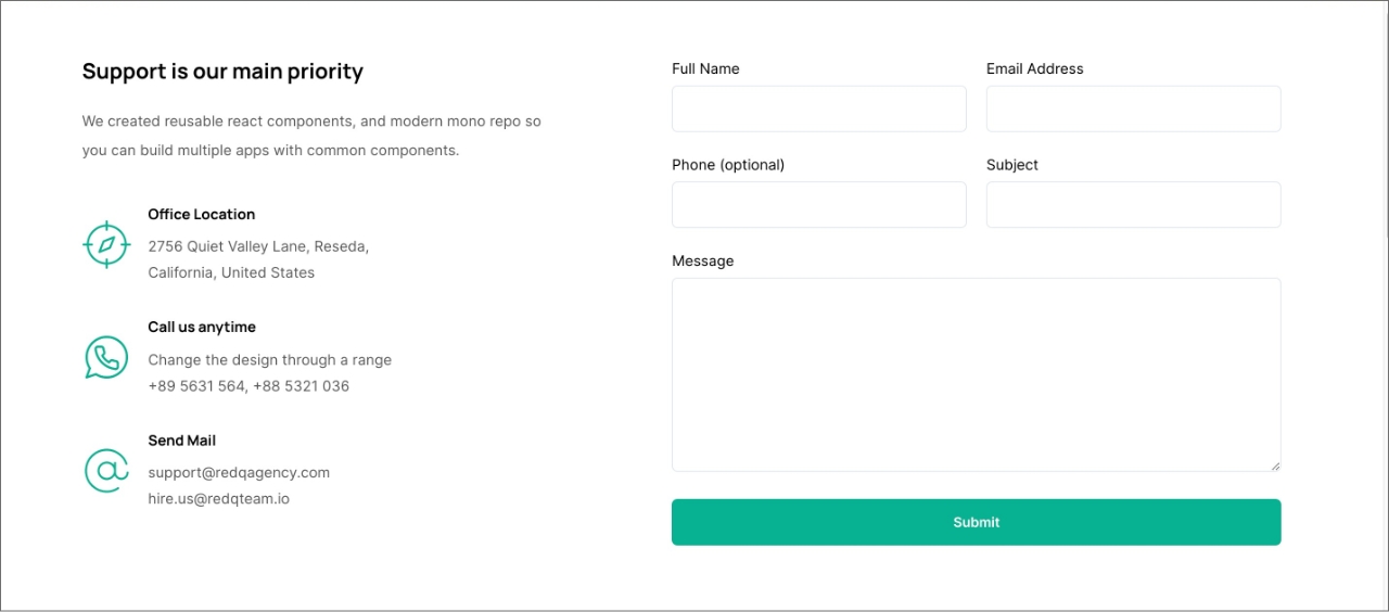
Contact Info Section editor view and settings
1. Block Wrapper
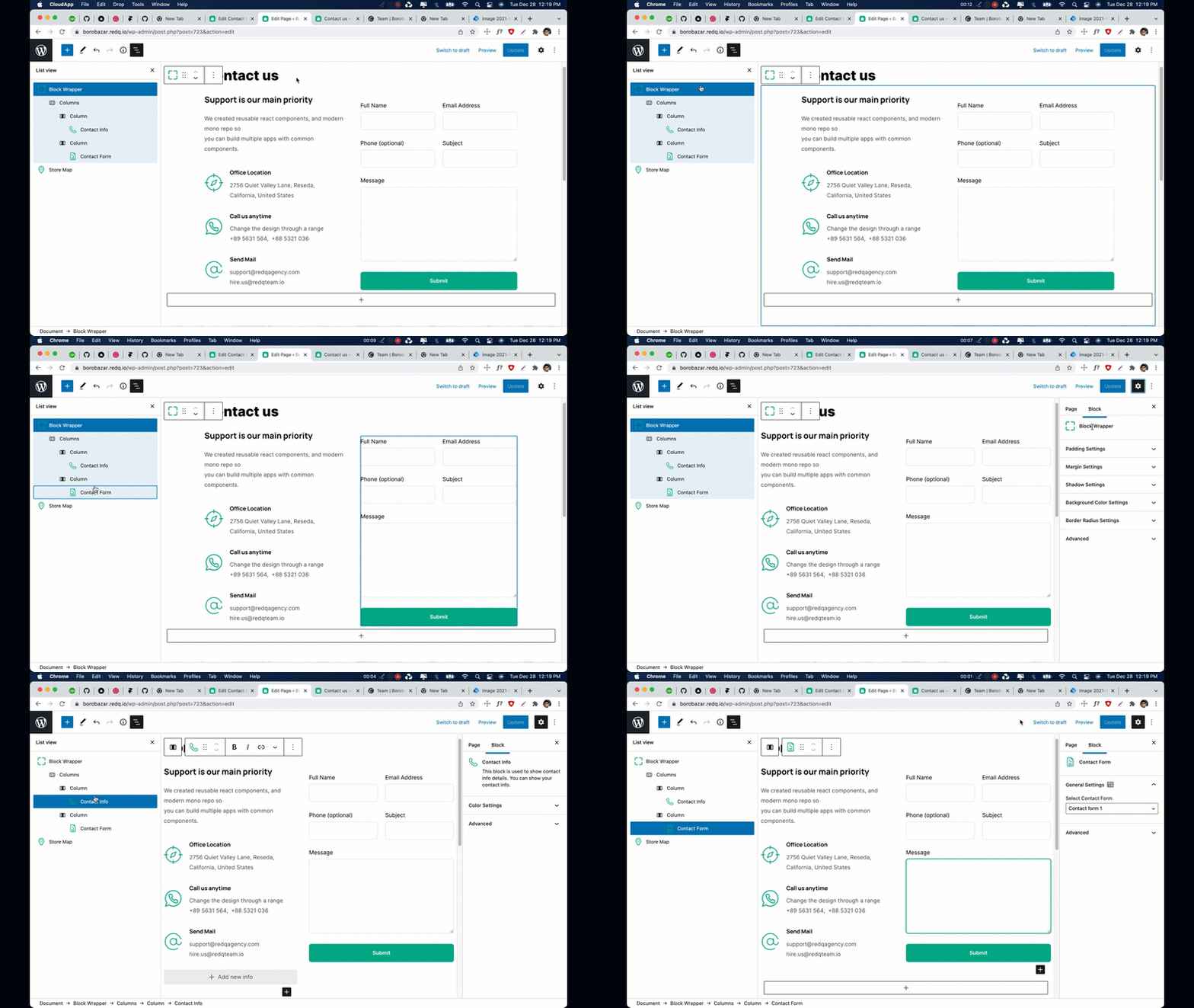
As you can see in the gif file. First we use Block Wrapper block as a Section Wrapper for adding padding and margin, Also we have background color, shadow & border radius options if you need. After that we add built in Columns block and choose two column layout in the first column we add our Contact Info block and for the second one we add our Contact Form Block-
2. Contact Info
From our contact info block, you can add block title, description and contact info list with icon/image like our Office Location, Call us anytime and Send Mail list.
3. Contact Form
Our contact form block basically use contact form 7. In order to use this block first you have to create a form from Contact Form 7 plugin. Install & active contact form 7 plugin then go to -
Dashboard -> Contact -> Add New
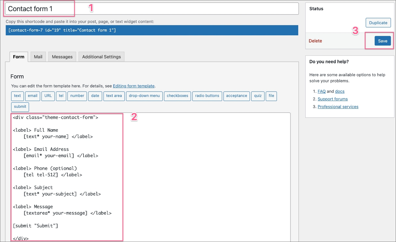
Enter a form name like Contact Form 1 then in the form editor paste the below code if you want to have same design like our demo. Specially the .theme-contact-form class wrapper -
<div class="theme-contact-form">
    <label> Full Name [text* your-name] </label>
    <label> Email Address [email* your-email] </label>
    <label> Phone (optional) [tel tel-512] </label>
    <label> Subject [text* your-subject] </label>
    <label> Message [textarea* your-message] </label>
    [submit "Submit"]
</div>
After creating the contact form from contact form 7 plugin. Now you'll be able to select that form. from our Contact Form block -
